Building an Amazon Price Intelligence Dashboard with Nimble Web Search Agents

Tom Shaked
Building an Amazon Price Intelligence Dashboard with Nimble Web Search Agents
Tom Shaked
Most popular articles

Get structured, reliable data for your stack.
The fastest way to understand a data platform is not to describe it.
It is to build something with it.
So we started with a simple question: could one person use Nimble Web Search Agents and an AI assistant to go from idea to working data product in a few days?
To make the test concrete, we chose a difficult web data problem: Amazon pricing.
Amazon is dynamic, location-aware, inventory-sensitive, and constantly changing. Product pages include price, availability, seller signals, delivery context, Subscribe & Save status, list price, Best Sellers Rank, and title variations. That makes it a useful proving ground for any workflow that claims it can turn the live web into structured data.
The question we used for the experiment was:
Does where you shop from change what you pay on Amazon?
And a second one:
How much can the price of a popular product change over the course of a few days?
Using Nimble Web Search Agents, Python, Streamlit, Plotly, Parquet, and Claude Code to help plan, code, debug, and analyze the workflow, we built a complete Amazon price intelligence dashboard.
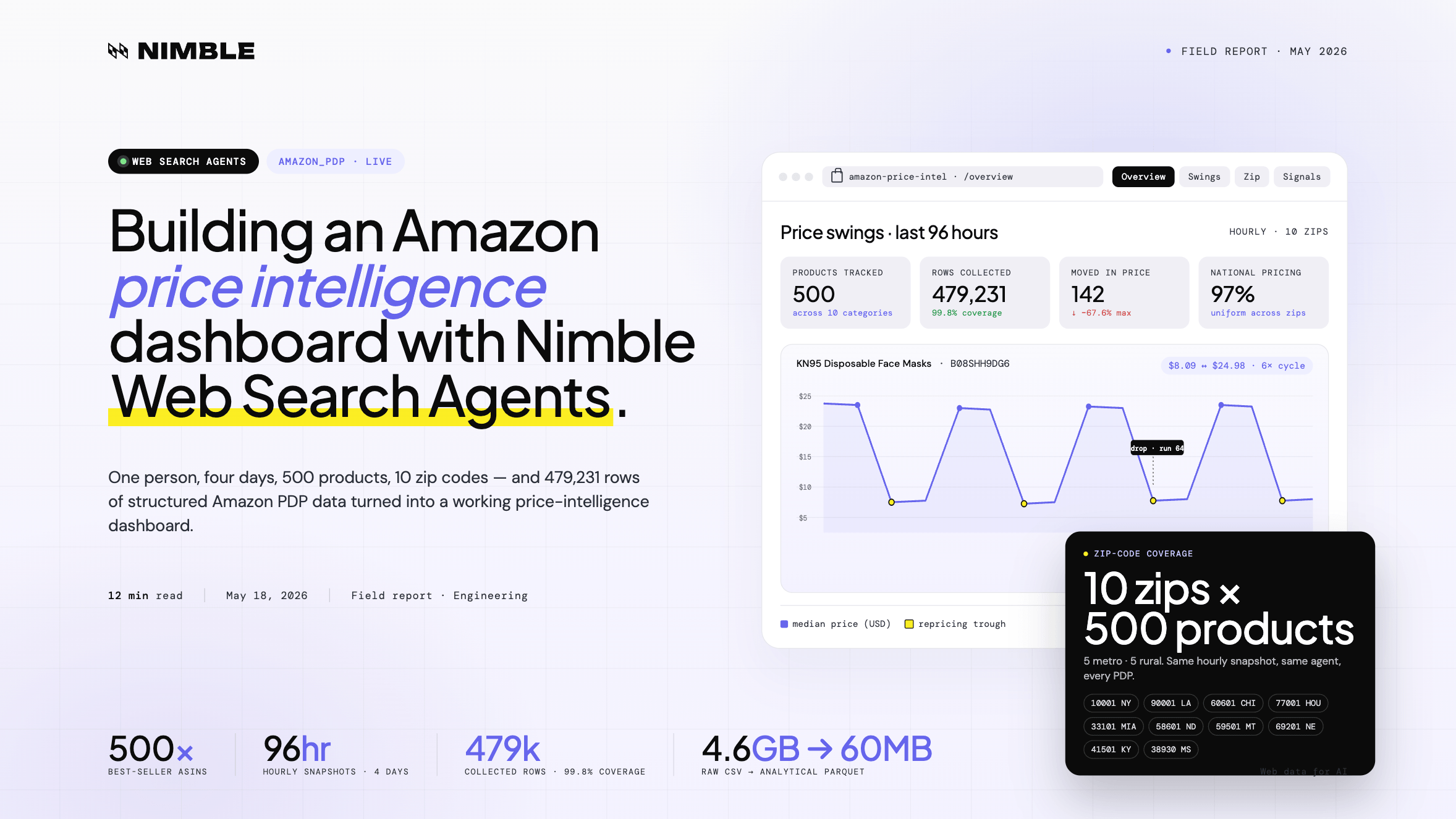
The result: 500 products tracked across 10 US zip codes, every hour, for 4 days — producing 479,231 rows of raw product data and a dashboard for exploring price changes, availability shifts, geographic differences, and product-page signals.
Clone it from Github to see the data and process: github.com/Nimbleway/cookbook-amazon-price-tracker
What we built
A full Amazon price intelligence pipeline.
The app collects Amazon Best Sellers products, expands each product across a set of city and rural zip codes, runs hourly Amazon PDP agent jobs for four days, processes the raw output into compact analytical datasets, and renders the final results in a Streamlit dashboard.
The stack:
Nimble Web Search Agents
Python
Streamlit
Plotly
Parquet
The final dataset includes:
500 Amazon products
10 US zip codes
96 hourly snapshots
~480,000 planned agent calls
479,231 collected rows
60+ fields per product
4.6 GB raw CSV compressed into ~60 MB of Parquet
The dashboard answers four kinds of questions:
Which products moved in price?
Which prices were national vs. location-specific?
Which products went out of stock?
Which non-price signals changed at the same time as price?
Here’s how it was built.
Step 1: Collecting 500 Amazon Best Sellers
The first step was building the ASIN list.
Instead of randomly sampling Amazon products, we wanted products that were actually meaningful in the marketplace. So we used the amazon_best_sellers Web Search Agent rather than a generic Amazon SERP agent.
The reason was simple: Best Sellers pages are ranked by purchase volume. That made the sample more representative of what people are actively buying, not just what happens to appear for a keyword search.
Before writing the pipeline, we inspected the agent schema through Nimble MCP. That confirmed the expected inputs, the output structure, and the rough pagination behavior: about 46 results per page.
Then we ran a single inline test call.
The response matched the schema, so we moved into collection.
We pulled products across 10 categories:
Electronics
Grocery
Health & Vitamins
Beauty & Personal Care
Toys & Games
Pet Supplies
Sports & Outdoors
Tools & Home Improvement
Kitchen & Dining
Office Supplies
The collection plan was:
10 categories
3 Best Sellers pages per category
30 total API calls
One cleanup step was needed: 17 ASINs came back with price = 0. These were mostly fresh produce and weight-based checkout items, where the product price is not represented cleanly as a standard PDP price.
Those were dropped and replaced.
The final output was:
data/asins.csv
500 rows
asin
category
rank
product_name
price
rating
This became the product universe for the rest of the experiment.
Step 2: Expanding every product across 10 zip codes
The core question was whether Amazon prices vary by location.
To test that, each ASIN needed to be queried from multiple US zip codes. We chose a mix of major cities and rural towns to create a simple city-vs-rural comparison.
The zip code set:
That created:
500 products × 10 zip codes = 5,000 input objects
Each input object represented one product-location pair.
That structure matters because Amazon PDP data is not just product-specific. It can also depend on delivery location, availability, seller options, shipping promise, and fulfillment path.
Step 3: Running the Amazon PDP Agent Job
Once the 5,000 input objects were ready, we configured the agent job in the Nimble UI.
The job configuration:
Agent: amazon_pdp
Schedule: 0 * * * *
Cadence: Every hour on the hour
Collection window: May 10 → May 14, 2026
Runs: 96 hourly snapshots
Scale: 5,000 calls/hour
Planned calls: 480,000
The job ran once per hour for four days.
At completion, Nimble delivered two raw Parquet files.
The final raw result contained:
479,231 total rows
96 runs
~99.8% coverage
That coverage rate is important. At this scale, even small failure rates can create large gaps. The goal was not to get a perfect row for every possible input in every run, but to collect enough consistent coverage to support product-level, location-level, and time-series analysis.
In this case, the dataset was dense enough to build reliable price timelines across products and zip codes.
Step 4: Processing the raw data into analysis-ready Parquet
The raw CSV export was 4.6 GB.
That is workable for batch processing, but too heavy for a responsive dashboard. So the next step was to convert the raw data into lean, purpose-built Parquet files.
The first processing script, phase3_process.py, created four core datasets:
The second processing script, phase4_process.py, extracted product signals beyond price:
The final dashboard data footprint was about 60 MB.
4.6 GB raw CSV → ~60 MB analytical Parquet
That compression is not just a storage improvement. It changes the user experience.
Instead of loading a huge raw dataset into memory and recalculating everything interactively, the dashboard reads already-modeled datasets built for the questions the app needs to answer.
Step 5: Building the dashboard
The final dashboard was built in Streamlit with Plotly visualizations and URL-based routing using st.query_params.
Rather than showing every raw field, the dashboard focuses on the highest-value questions from the dataset:
How many products changed price?
Which products had the largest swings?
Were prices different across zip codes?
Which products went out of stock?
Which product-page signals changed together?
The dashboard has four main views:
Overview
Price Swings
Zip Comparison
Signals & Events
The Overview page gives the top-line metrics and key findings: total rows collected, products tracked, hourly snapshots, products where price moved, products with uniform national pricing, and products that went out of stock in at least one zip code.
The Price Swings page highlights the biggest movers, including products like KN95 masks and Beats Solo 4, and makes it easy to compare each product’s minimum and maximum observed price.
The Zip Comparison page focuses on the original location question. It shows that most products had the same median price across all tested zip codes, while a small set of exceptions showed location-based differences.
The Signals & Events page looks beyond price, surfacing availability changes, title changes, MSRP movement, Subscribe & Save shifts, and events where multiple product-page signals changed at the same time.
Each product also has a detail view with its price timeline, zip-level comparison, BSR trend, availability history, and MSRP history.
The goal was not just to create charts. It was to make the dataset explorable — so a user could move from a headline insight to the specific product behavior behind it.
What the data shows
The experiment produced eight core findings.
1. Amazon repricing can happen in visible cycles
The KN95 mask product repeatedly dropped from $24.98 to $8.09 and recovered six times in 96 hours.
That is not a normal one-time promotion pattern. It looks more like a repricing loop.
2. Launch prices can correct suddenly
Beats Solo 4 started at $109.95 and jumped to $199.95 at run 56.
The MSRP reset at the same time, shifting the product from a discounted state to full retail.
3. Most pricing was national, not local
97% of comparable products had uniform pricing across all tested zip codes.
That was one of the clearest findings in the dataset.
4. Location-based exceptions exist, but they were rare
Only 12 products showed meaningful zip-code price differences.
Those exceptions were concentrated in electronics and heavy goods, where fulfillment and shipping factors may be more relevant.
5. Amazon titles are live optimization surfaces
11 products showed title A/B behavior during the collection window.
The Body Restore Shower Steamers example showed a large Best Sellers Rank difference between title variants.
6. Some listings are visible but functionally unavailable
The Blink Video Doorbell Add-On was out of stock in 92.7% of runs.
From a shopper’s perspective, the listing exists. From a conversion perspective, it is mostly dead inventory.
7. Subscribe & Save can behave like an inventory signal
Subscribe & Save availability mirrored out-of-stock behavior closely.
When stock disappeared, Subscribe & Save disappeared. When stock returned, Subscribe & Save returned.
8. MSRP changes are more dynamic than expected
81 products had list-price changes in four days.
That means MSRP should not always be treated as a stable baseline in Amazon pricing analysis.
Why this works: Web Search Agents plus scheduled collection
The hard part of this project was not building a dashboard.
The hard part was collecting structured, reliable Amazon product data at a consistent cadence, across hundreds of products and multiple locations.
A traditional scraping approach would require custom PDP extraction logic, proxy management, rendering, retries, scheduling, schema maintenance, and storage orchestration.
That gets complicated quickly.
Nimble Web Search Agents compress that work into callable web data workflows.
In this project:
amazon_best_sellers created the product universe
amazon_pdp collected product-page data
Nimble Agent Jobs handled hourly scheduled execution
Python normalized and compressed the data
Parquet made the dashboard fast
Streamlit and Plotly made the dataset explorable
That division of labor is what made the project practical.
Nimble handled the live web data layer. Python handled transformation. Streamlit handled the interface. The final result was not just a scrape, but a repeatable intelligence system.
The full pipeline
The project started with a simple question about location-based pricing.
It ended with a dashboard that can surface repricing bots, launch corrections, ghost listings, title tests, MSRP changes, Subscribe & Save inventory behavior, and synchronized product-page events.
Final thoughts
We live in an exciting new era where intelligence and capabilities are more accessible than ever before, freeing us from traditional limitations like engineering hurdles.
A single builder can start with a question, use an AI assistant to shape the research plan, inspect available Nimble Web Search Agents, generate the input set, launch a scheduled data collection job, process hundreds of thousands of rows, and turn the result into an interactive dashboard.
That is the real shift.
Nimble provides the live web data infrastructure. The AI assistant helps orchestrate the workflow around it: planning the experiment, writing the scripts, debugging the pipeline, exploring the data, and turning raw outputs into something people can actually use.
In this case, the subject was Amazon pricing. But the same pattern applies to any workflow where live web data needs to become structured intelligence:
Pick a question
Choose the right Web Search Agents
Collect fresh data at scale
Process it into analysis-ready datasets
Use an AI assistant to iterate faster
Build a dashboard, report, or automated workflow on top
That is what makes the combination powerful.
Not just better scraping.
A faster path from idea to working data product.
FAQ
Answers to frequently asked questions
.png)
.png)
.png)
.png)
.avif)
.png)