Building a Real Estate Investment Scout with Nimble Web Search Agents and Claude

Tom Shaked

Building a Real Estate Investment Scout with Nimble Web Search Agents and Claude
Tom Shaked
Most popular articles

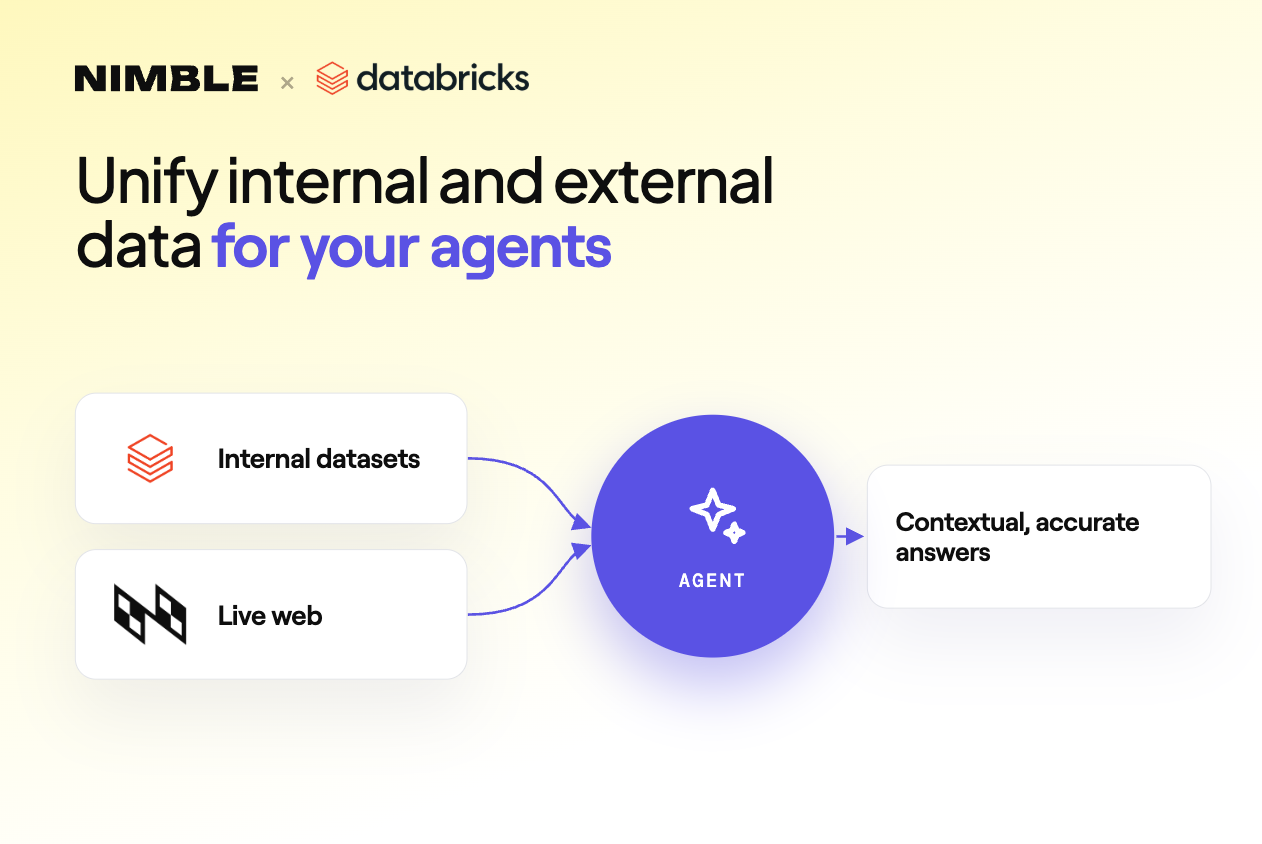
Get structured, reliable data for your stack.
Real estate investing has a research problem.
The data exists, but it is scattered across market pages, listing platforms, local reports, and analyst commentary. A human investor can piece it together, but the workflow is slow: compare city-level housing trends, rank markets, pull active listings, read local market reports, and decide where the opportunity is actually strongest.
That kind of work usually takes days.
So we built a data app that does it in under 30 minutes.
Using Nimble Web Search Agents, Claude, Streamlit, Plotly, and pydeck, we created a real estate investment scout that scans 100 U.S. housing markets, ranks them based on investment signals, pulls active listings from Zillow, generates deep market research, and turns everything into an interactive dashboard.
The result: 100 cities analyzed, 1,199 active listings collected, 10 investment markets selected, and a dashboard that lets you move from national market scan to individual property exploration without copy-pasting data from a single website.
See it live on Github: github.com/Nimbleway/cookbook-real-estate-scout
What we built
A fully automated real estate investment research pipeline.
The app collects housing market data from Redfin, scores 100 U.S. cities, asks Claude to select and explain the top 10 investment markets, pulls active Zillow listings across representative zip codes, generates deep market reports using Perplexity through Nimble, and renders the final output in a four-tab Streamlit dashboard.
The stack:
Python
Nimble Web Search Agents
Claude API
Streamlit
Plotly
pydeck
The final dataset includes:
100 Redfin market snapshots
10 Claude-ranked investment markets
1,199 Zillow active listings
10 deep market reports
Under 30 minutes total runtime
Here’s how it was built.
Step 1: Collecting housing market data from Redfin
The first layer of the app is market-level context.
Before looking at individual properties, the system needs to know which cities are worth investigating. For that, we used a Nimble Redfin market data agent:
redfin_market_housing_data_community_2026_05_02
The agent was called once per city, passing:
city_id
url_city
url_state
For each city, it returned structured housing market data:
Median sale price
Average days on market
Sale-to-list ratio
Year-over-year price change
Number of homes sold
Price per square foot
Natural-language market description
We ran this across 100 U.S. cities, covering major metros, emerging markets, Sun Belt markets, Midwest cities, and coastal markets.
The result:
100 / 100 successful
All responses saved to data/raw/redfin_*.json
This is the first point where the workflow changes from manual research to a repeatable data pipeline. Instead of opening Redfin market pages one by one, copying stats into a spreadsheet, and hoping every page has the same structure, each city comes back as structured data ready for scoring.
Step 2: Scoring 100 cities
Once the Redfin data was collected, the next question was: which markets actually look investable?
The first pass used a weighted composite score in Python. The goal was not to make the final investment decision automatically, but to narrow 100 cities down to a strong shortlist for Claude to analyze.
The scoring formula weighted five factors:
YoY appreciation:                 30%
Sale-to-list ratio:               25%
Days on market, inverted:         20%
Transaction volume:               15%
Affordability, price inverted:    10%
That formula captures a simple investor logic.
Markets with strong appreciation are rewarded. Competitive markets with high sale-to-list ratios are rewarded. Faster-moving markets are rewarded. Liquid markets with more transactions are rewarded. And all else equal, more affordable markets get a boost because the entry point matters.
The top 30 cities were then passed to Claude for final selection.
Step 3: Asking Claude to think like an investor
The scoring formula gives structure. Claude adds judgment.
After the preliminary ranking, Claude received the top 30 markets and was asked to select the 10 strongest investment opportunities. The prompt forced the model to balance appreciation trend, competitiveness, affordability, and liquidity.
The prompt:
You are a real estate investment analyst. Below are 30 US housingmarkets ranked by a preliminary composite score.Your job: select the top 10 markets for investment and explain whyeach one made the cut. Think like an investor — balance appreciationtrend, market competitiveness, affordability/entry point, and liquidity.For each of your top 10, provide:- City, State- Investment thesis (2-3 sentences)- Key risk (1 sentence)Return as a JSON array only.Claude’s top 10:
The useful part was not just the ranking. It was the explanation layer.
For example, Claude identified Philadelphia as a rare mix of affordability, appreciation, and liquidity:
“Philadelphia’s $300K median paired with 11.1% YoY appreciation and 1,211 homes sold offers a rare combination of affordability, growth momentum, and deep liquidity in a major metro.”
It flagged San Francisco’s unusually high sale-to-list ratio as a possible rebound signal:
“San Francisco’s 115.6% sale-to-list ratio — highest on the list — signals a market snapping back from its post-pandemic correction, driven by AI sector hiring.”
And it framed Virginia Beach as a market with an economic floor:
“Virginia Beach combines a 23-day days on market with a permanent military employment base — an economic floor that insulates the market from private-sector cyclicality.”
That is the pattern the app uses throughout: Nimble gathers the live web data, python normalizes and scores it, and Claude turns the structured data into an analyst-readable thesis.
Step 4: Pulling active listings from Zillow
City-level data tells you where to look. Listings tell you what is actually available.
For the 10 selected markets, we pulled active Zillow listings using the Nimble Zillow PLP agent:
zillow_plp
Each call passed:
zip_code
listing_type: "sales"
For every top market, we picked three representative zip codes:
Downtown
Mid-city
Residential neighborhood
That gave each city a more balanced view. Instead of only looking at the urban core, the app captured a cross-section of the local market.
In total:
30 Zillow API calls
30 / 30 successful
1,199 active listings collected
Average: 39 listings per zip code
Price range: $60K–$29.9M
Each listing returned:
Full address
Latitude and longitude
Price
Beds
Baths
Square footage
Home type
Days on Zillow
Photo URLs
One discovery: Zillow’s city field returns the property’s actual municipality, not always the target market.
A listing pulled for the Columbus market might come back labeled as Bexley. A listing pulled for Kansas City might come back as Gladstone. That is technically correct, but it creates a problem for market-level grouping.
The fix was to derive the market name from the source filename instead of trusting the city field in the Zillow response.
That kind of detail is small, but it matters. Real estate data is messy because geography is messy. A usable app needs to preserve the investment-market grouping even when individual listings sit in surrounding municipalities.
Step 5: Generating deep market reports with Perplexity
Market stats and listings are useful, but they do not tell the whole story.
A good real estate analyst also wants the local narrative: rental demand, submarket trends, affordability pressure, employment drivers, and risks.
For that layer, we used the Nimble Perplexity agent directly inside Claude through the MCP tool.
The prompt for each city:
Give me a detailed real estate investment analysis for [City], [State]
for 2025-2026. Cover: appreciation trends, affordability, rental demand,
and key risks. Be specific with data points where possible.
Eight cities were fetched in parallel. The reports came back between 2,000 and 4,800 characters each, covering:
Appreciation forecasts
Rental demand drivers
Submarket breakdowns
Investor risk signals
Affordability context
There were two useful gotchas.
The first call failed with a 400 error because the wrong parameter name was passed. We used:
query
But the agent schema expected:
prompt
The fix was simple: check the agent schema before calling the agent. But it is a good reminder that agent workflows are only as reliable as the contract between the caller and the agent.
The second issue was formatting.
Perplexity returned a single unformatted text blob with no newlines. Section headers like “Affordability” and “Rental demand” were concatenated directly into the previous sentence.
The fix happened at render time using regex rules that detected likely section boundaries and inserted paragraph breaks.
Again, the underlying data was useful. The app just needed a cleanup layer before showing it to users.
Step 6: Building the dashboard
The final app is a four-tab Streamlit dashboard built with Plotly and pydeck.
The dashboard is not just a visualization layer. It is the product interface for the entire research workflow.
Tab 1: National Market Scan
The first tab shows all 100 cities on a U.S. map.
Bubble size represents transaction volume. Color represents investment score. The top 10 markets are ringed in gold.
This tab also includes:
Sortable rankings table
Price vs. YoY appreciation scatter plot
National view of all scored cities
The purpose is to show the full funnel: not just the winners, but the context around why those markets stood out.
Tab 2: Top 10 Investment Markets
The second tab focuses on the selected markets.
It includes a radar chart comparing five normalized dimensions across markets, plus a horizontal bar chart with a metric selector.
Each city gets a card with:
Rank badge
Key market metrics
Claude investment thesis
Claude risk summary
This tab turns the ranking into an investor-readable shortlist.
Tab 3: Listings Explorer
The third tab is where users can browse the 1,199 active listings.
Filters include:
Market
Price range
Bedrooms
Home type
The map uses pydeck, with every listing shown as a dot. Color represents price tier:
Green: under $300K
Yellow: $300K–$700K
Red: $700K–$1.5M
Purple: above $1.5M
Below the map, the app shows aggregated stats and a 24-listing photo gallery.
This is where the app starts to feel less like a report and more like an investment tool. You can move from “Kansas City looks attractive” to “show me available 3-bedroom homes under $350K” in the same interface.
Tab 4: City Deep Dive
The final tab lets users select any of the top 10 markets and inspect it in more detail.
Each city view includes:
Five key metric cards
Full-width Claude investment thesis
Full-width Perplexity market report
Read More expander
Street-level pydeck listing map
Price histogram
Home type breakdown
12-listing photo gallery
The map uses CARTO dark matter public tiles, so there is no Mapbox API key required.
What the data shows
The app does not try to predict the future. It does something more practical: it compresses a research workflow.
A human investor would normally need to jump between Redfin, Zillow, local reports, spreadsheets, and notes. The app turns that into a repeatable pipeline:
Collect market stats
Score cities
Select top markets
Explain the thesis
Pull active listings
Generate local reports
Render everything in a dashboard
The interesting part is how different each layer is.
Redfin gives market-level indicators. Zillow gives live inventory. Claude gives investment reasoning. Perplexity gives local context. Streamlit makes the workflow explorable.
None of those pieces replaces the others. The value comes from chaining them together.
Why this works: Web Search Agents plus Claude
The hard part of this project is not drawing charts.
The hard part is getting reliable, structured, current data from multiple live web sources.
Redfin market pages, Zillow listing pages, and Perplexity research outputs are all different surfaces. They have different schemas, different parameters, different quirks, and different failure modes. A traditional approach would mean writing custom scraping logic for every source, maintaining selectors, handling rendering, debugging failures, and cleaning inconsistent output.
Nimble Web Search Agents compress that work into callable data endpoints.
The Redfin agent returns structured market stats. The Zillow agent returns structured listing data. The Perplexity agent returns deep research. Claude sits on top of those outputs and performs the work LLMs are good at: ranking, summarizing, explaining tradeoffs, and turning raw data into a thesis.
That division of labor is the key.
Nimble handles the live web data layer. Claude handles the reasoning layer. Python handles scoring and orchestration. Streamlit handles the interface.
The result is a data app that would have been tedious to build manually and painful to maintain as a scraper, but straightforward to assemble as an agent-driven workflow.
The full pipeline
Total runtime: under 30 minutes.
Final thought
Real estate research is a good example of why live web data matters.
The opportunity is not sitting in one database. It is spread across market pages, listing platforms, local research, and fast-changing inventory. The best answer comes from combining those signals, not from reading any one source in isolation.
That is what Web Search Agents make possible: live, structured data from the web, delivered in a format that AI systems and data apps can actually use.
Claude did not need to browse manually. Python did not need brittle scrapers. The dashboard did not need a static CSV.
The app just needed agents that could bring the web into the workflow.
FAQ
Answers to frequently asked questions
.png)


.png)
.png)
.avif)